Cartomapping in Python
When writing my thesis, I decided to redo some cartographic plots from an earlier paper. Between moving out, changing labs, and a dead computer, there was little hope; I did not have the old software or data at hand. I used (the late) Basemap in conjunction with matplotlib to create nice maps of Canberra. I now want to resurect this to work, but I will be using cartopy.
Getting Started
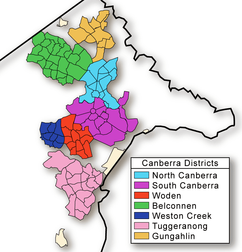
This is the sort of result that I want to achieve. The minimum I want to have are suburb boundaries. But I would prefer something a bit more detailed:
- District boundaries.
- Topography.
- Landmarks.
The good thing is the Australian Bureau of Statistics (ABS)1 has an open data portal where they upload such things as shapefiles. In combination with Cartopy, a Python library on top of matplotlib to draw maps, I think I can have a professional result – hopefully, with little effort.
Cool maps with Cartopy
I have to say, coming from the late Basemap, that drawing with Cartopy is straightforward. The first thing we want to do is to create our map.
import matplotlib.pyplot as plt
import cartopy.crs as ccrs

proj = ccrs.PlateCarree()
ax = plt.axes(projection=proj)
ax.set_extent([148.95, 149.22, -35.49, -35.12], crs=proj)
Note: I already had the lat/lon values from before, but they could be extracted by using the bounds of the shapes.
Using shapefiles, we can manipulate entries as records which own their geometry. We just need to pass a list of geometries to the axis (i.e., the actual plot) with a reference system. Now let us try to display the map with the following:
- SA3: roughly equivalent to a suburb, these will be drawn in gray.
- SA2: roughly equivalent to a neighbourhood, these will be drawn in light blue.
import cartopy.feature as cf

sa2_shapes = cf.ShapelyFeature(
    [sa2.geometry for sa2 in sa2s],
    proj,
    facecolor="none",
    lw=1,
    edgecolor="tab:blue",
)
ax.add_feature(sa2_shapes)

sa3_shapes = cf.ShapelyFeature(
    [sa3.geometry for sa3 in sa3s], proj, facecolor="none", lw=1, edgecolor="gray"
)
ax.add_feature(sa3_shapes)

This is actually fairly good. But things like lake Burley Griffin do not appear. We can do slightly better by removing the frame and adding suburb (SA3) names. Furthermore, we will colour each SA2 in a given SA3 with the same colour.
Adding colour
![]()
Okay, the names are not very readable. “Canberra East” is too far East – and also pretty much not an actual suburb.2 There is still some border left.
But my main issue is that we are colouring a bunch of empty SA2s. Worse, Lake Burley Griffin, in the center, now looks like a suburb. According to the ABS, SA2s can be empty; in my case I want to represent living areas. There is no real secret here, I went and found them by hand.
Cleaning up

Now, this is a pretty good result. I have most of what I need, but the lake standing on its own seems a bit odd. For the life of me, I did not manage to plot rivers that Cartopy is supposed to handle. So, I started looking at backgrounds…
Backgrounds

Long story short, it is nigh impossible to find a raster image detailed (and small) enough to plot a worthwhile background. After scouring the web for some time – including Cartopy’s doc – I finally found the answer: image tiles. And this how I plotted the third vignette in the image above.
import cartopy.io.img_tiles as cimgt
import cartopy.crs as ccrs
import matplotlib.pyplot as plt

bg = cimgt.OSM()
# Select a projection from `cartopy.crs`
ax = plt.axes(projection=ccrs.PlateCarree())
# Set coordinates of upper-right and lower-left corners
ax.set_extent([ur_lon, ll_lon, ur_lat, ll_lat])
ax.add_image(bg, zoom)
# Cf. https://makersportal.com/blog/2020/4/24/geographic-visualizations-in-python-with-cartopy
# NOTE: zoom specifications should be selected based on extent:
# -- 2     = coarse image, select for worldwide or continental scales
# -- 4-6   = medium coarseness, select for countries and larger states
# -- 6-10  = medium fineness, select for smaller states, regions, and cities
# -- 10-12 = fine image, select for city boundaries and zip codes
# -- 14-19 = extremely fine image, select for roads, blocks, buildings
Note: make sure you use Axes.set_extent() or the keyword extent when plotting backgrounds. Otherwise, you will run into huge memory usage.
Conclusion

I am pretty happy with how this all turned out. Using cartopy is straightforward; I did not have to throw away old things; I learned to add (nice) backgrounds. There are still things that could be improved – but I think I will stop here:
- Technically, Queanbeyan (near the bottom right yellow patch) is part of the Canberra community.
- I am not 100% sure I got the right SA2s (missed inhabited ones or still have empty ones).
- As I work in transport, having an overlay of the roads would be neat too.
Footnotes
There is even an interactive map. ↩
I removed the Urriarra - Namadgi SA3, to the South, as it only contains roads and national parks. ↩