Ascii Boxplots
Today, I did a thing; it feels good as last week was slow, after submitting a paper and getting another rejected. I needed to make something, so I picked an old idea: boxplots in the terminal. I want to be able to visualise the distribution of some data, a five-number-summary is a bit terse in my opinion. So I implemented a quick prototype in Python, keeping in mind the Linux philosophy.
Drawing boxplots
A boxplot, also known as a “whisker plot,” is a visualisation of a five-number-summary. A five-number-summary of a given dataset gives us five percentiles:1 the 5%, 25%, 50%, 75% and 95%. Being percentiles, the 50% is the median, not to be confused with the mean of the distribution. So, that’s what we want to plot – using Seaborn’s tips example:2
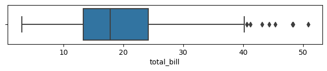
Note that Seaborn does something a little different. It plots the distribution and the outliers, I am not sure how this is done but I will be taking a simpler route.
How to plot in a terminal
The main challenge of plotting in a terminal is the lack of resolution. Indeed, the best I can hope for is one-character-wide symbols. But, this also drives the design of the tool: I need to figure out in which “character box” does the parts of the box end up.
Therefore, what we want to do is:
- Compute the range of data.
- Divide that number by the width (number of characters) of the plot to get the step size.
- For each character of the plot, determine what goes in there: an empty space or an element of the box.
In other words, step 3 here consists in setting a variable to the minimum value of the box and incrementing it by the step size and determining which part of the box this corresponds to.
The tricky bits
I reckon the thing that is the most complicated here is to plot the axis properly. Not only do the range of data and the position of the ticks matter, but a tick mark may be more than one-character wide. In this case, I need to take the extra width into account.
Also, I started by using the range of values in the data to determine the step size and such. I quickly realised that this is wrong. The axis is our source of truth when it comes to plotting; the data is drawn onto a grid created by the axis.
The other error that creeps up is drawing too much. You need to make sure you print only one character per step, otherwise the box will be skewed.
The results
I wanted to make a Linux tool, so text in/text out, interoperable, etc. So, you can either pass a --file parameter or pipe data directly to it. The expected input is a list of numbers, one per line. I am not quite sure another utility could efficiently consume the output though. The code is available online.
If we are to plot the distribution of tips as presented in the table below,2 we have:
Default boxplot, print all five numbers (5%, 25%, 50%, 75%, 95%). The ‘
:’ is the median, ‘=’ the range between the quantiles and ‘-’ the range between the ends of the box, which are ‘|’.$ cat tips | python termbox.py |-------=====:============----------------------| 9 16 24 31 39Option to print the outliers (1% and 99%).
$ cat tips | python termbox.py --outliers
+   |----===:=========---------------|           +
7          17            28         38           49
I decided to show the extrema (min and max) of the distribution as ticks rather than in the actual plot. This is due mainly to the resolution problem, the plot becomes unreadable with too much info.
$ cat tips | python termbox.py --outliers --maxima
    +  |----===:========-------------|         +
3           15          27           39          51
You can change also the number of ticks.
$ cat tips | python termbox.py --outliers --maxima --nticks 7
    +  |----===:========-------------|         +
3       11      19      27       35      43      51
In parting
There are still some things that could be done better. The functions plot_vals() and plot_ticks() could return strings instead of using print(). This would be better design, enable testing, etc.
I wondered about making multiple plots, but this becomes tricky quickly as I don’t want to have to handle formatting. The axis only displays integers for now, I could try to have up to one decimal place but I would rather it were for specific cases. I want to add a --width parameter to change the size of the plot, currently it is fixed at 50.
Anyway, I don’t think this is very useful, but it is a cute tool. I may even use it at work as we discuss quite a bit online these days and I find that more readable than the five-number-summary. Hope you like it!
Footnotes
| count | 244.000000 |
| mean | 19.785943 |
| std | 8.902412 |
| min | 3.070000 |
| 1% | 7.250 |
| 25% | 13.347500 |
| 50% | 17.795000 |
| 75% | 24.127500 |
| 99% | 48.227 |
| max | 50.810000 |