Practical LaTeX Typography
I write scientific articles using org-mode and exporting to LaTeX. I have never loved the standard look and feel of a LaTeX-produced PDF. I do love the quality of the typesetting it provides though. I will try to have good typography by simply loading a few packages.
Typography

In a nutshell: typesetting is making sure content stays on the page while typography is the art of making it attractive. With this in mind, I will try to follow advice from:
- Practical Typography, by Matthew Butterick; and,
- The Elements of Typographic Style, by Robert Bringhurst.
My goal is to obtain a simple template for writing more attractive drafts.1
One of the main advantage of using LaTeX is we avoid many of the usual pitfalls of bad typography – e.g., kerning, indents, justification and hyphenation, symbols and accents, punctuation and quotation marks, etc.
Now, my goal is to improve that with minimum effort. There is a wide variety of packages available on CTAN and I plan to use a few of them. I want to avoid writing TeX code at this point.
tl;dr
With little effort, you can make a basic LaTeX document more visually pleasing by using a few packages and compiling it with lualatex. I compiled the results in a new class. Below is a short list of the core packages and configuration needed:
- Font size of 12pt.
geometry, page is 2.3 times the length of an alphabet (~345pt).fontspec, use libertine as default font.titlesec, to have Bringhurst-style headings.enumitem, diminish lead between list items.microtype, because it is a great package.
Result
Getting started
Typography is the visual component of the written word.
—Matthew Butterick
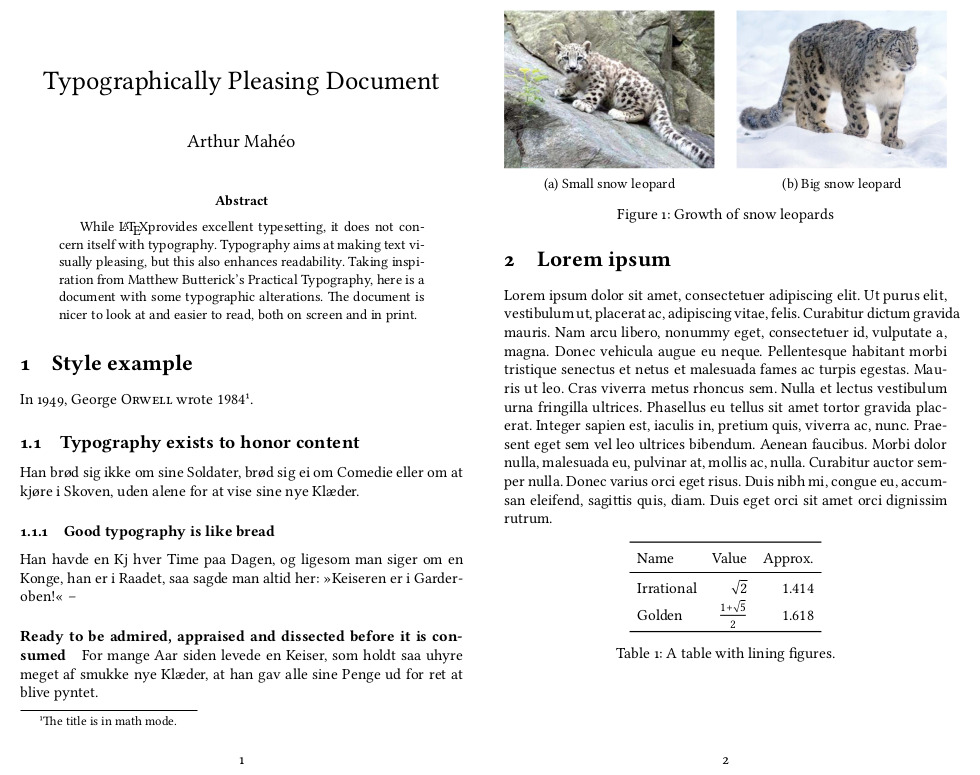
Because I am going to write a scientific paper, I want a few things: no table of content, an abstract and at least four section levels. I will use lualatex as compiler for the document because fonts are missing some ligatures with pdflatex.
The examples come from The LaTeX Font Catalogue, lipsum text from the eponymous package lipsum, and the extra content from me. To generate the images, I used imagemagick with a bit of -trim and -border.
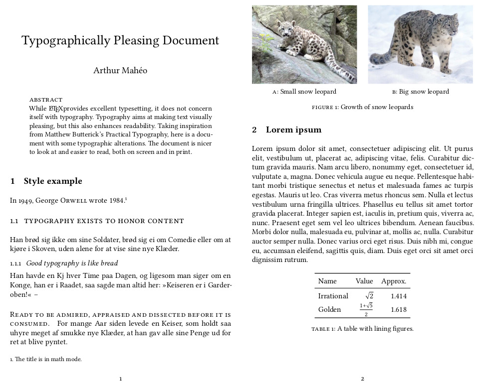
By default, here is what to expect when compiling such a LaTeX document:
Research paper
Practical Typography actually has a page dedicated to research papers. Let us see what it says:
- Page margins too small; line length too wide.
- Point size too big.
- Line spacing too tall.
- Times New Roman – snore.
- Failure to put one space between sentences.
- First-line indents too deep.
- Justified text without hyphenation.
- Underlining in headings.
By using LaTeX, we avoid points: 3,2 6, 7 and 8 for sure; other points are disputable. So, my question is: can I make this slightly more visually appealing with minimum effort?
Fixing the page
Page layout
Let us start by fixing the point size and make the page A4 as it is the size most widely used.
\documentclass[12pt, a4paper]{article}
Now the issue is the line length is too long. From the LaTeX wiki, we can actually find the following snippet:
For example, on A4 paper a document will typically have 44mm margin widths on the left and right of the page, leaving about 60% of the page width for text. The reason is improved readability. Studies have shown that it’s easier to read text when there are 60-70 characters per line – and it would seem that 66 is the optimal number.
This is in line with what most typography guides recommend. Another rule of thumb is to have a text width of ~2.5 times the length of a roman alphabet – which should amount to 65 characters.3 After some experimenting, I found that a ratio of 2.3 consistently achieves the right number of characters per line.
| Font size | Geometry | Text width (pt) |
|---|---|---|
| 11pt | None | 345 |
| 11pt | 44mm | 347.12 |
| 11pt | alphabet | 321.41 |
| 12pt | alphabet | 344.75 |
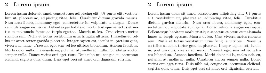
lipsum with default parameters (left) and alphabet sizing (right).Note: Changing fonts will also change the aspect.
This is still quite wide, but making it significantly smaller tends to make the page look barren. One way around that is to use a two-column layout, but that is another topic. I personally feel like going with the alphabet method as it will auto-adjust if you need to change the paper size or the font.
\newlength{\alphabet}
\settowidth{\alphabet}{\normalfont abcdefghijklmnopqrstuvwxyz}
\usepackage[textwidth=2.3\alphabet]{geometry}
With this, we fixed points: 1 and 2.
Changing font
The default font for LaTeX is: Computer Modern, and it gets old really quickly. I can never quite have a neat rendering on screen (especially at small sizes), printed it is too thin, etc. One font I do love is libertine. Libertine Fonts is a free software with a libre license. They are a family of high-quality fonts with all the bells and whistles of professional ones.4
Not only do Libertine Fonts look nice, they also have a neat integration with math fonts. The standard package provides: serif, sans-serif, and monospaced fonts. The sans-serif is called biolinum. One thing I do not like are the monospaced fonts provided, so I usually resort to another font: DejaVu Sans Mono.
To set the fonts, I decided to rely exclusively on fontspec, a very comprehensive package to handle OpenType fonts. It also provides extra commands that set font features locally, as you will see later.
\usepackage{fontspec}
\usepackage{unicode-math}
\setmainfont[
  Ligatures=TeX,
  Numbers={OldStyle, Proportional},
]{Linux Libertine O}
\setmonofont[Scale=MatchLowercase]{DejaVu Sans Mono}
\setmathfont[Scale=MatchUppercase]{libertinusmath-regular.otf}
fontspec can quickly become a black-hole as it provides very fine tuning capabilities. I decided not to delve too deep into it and went with: “less is more.” Of note, I use old-style (or, proportional) figures for the numbers as they integrate better with text.
I have to say here that I used to use pdflatex, but it has worse font support: missing ligatures, and old style figures cannot differentiate between text and math mode, which for me is a big “no.” Using lualatex you get the nice integration of old style and lining figures.
Tweaking old-style figures
Obviously, there is a caveat: this setup uses old style figures everywhere – in tables, footnote marks, etc. – which defeats the purpose. The good thing is, it is quite an easy fix with etoolbox:
\usepackage{etoolbox}
%% Use lining fonts
\newcommand\lining{\addfontfeatures{Numbers={Monospaced, Lining}}}
\AtBeginEnvironment{tabular}{\lining} % In tables
\renewcommand{\theequation}{ {\lining\arabic{equation}}} % For equation numbers
For citations. In case you use numeric citation style, you may want to add this:
\renewcommand*{\citesetup}{
  \lining
  \biburlsetup
  \frenchspacing}
Good, we fixed point: 4.
Spacing
Although LaTeX technically does not use a double space, but rather a slightly longer space, we want single spacing. This can be changed with the following command:
\frenchspacing
This fixes point 3.
Taking a breath
We can stop here, we have technically fixed all issues pointed out in Practical Typography. However, I would like to enhance the final appearance a smidgen more.
Beautifying
This is where typography becomes an art. Although we now meet the typographic requirements, we can still work on the appearance of the text in order to make it more appealing. And this is where opinions start clashing: use of bold or italic, number of sections, centering, etc.
Micro-typographic optimisations
The microtype package5 deals with the smaller typographic details that make a document pleasing: kerning, spacing, ligatures. The ’tracking’ options makes sure that it does not attempt to kern small caps as it may results in weird artefacts because of the extra letter spacing. Protrusion and expansion allow certain character to move beyond the margins for a smoother read.
\usepackage[protrusion=true, expansion=true]{microtype}
One issue (sic) with microtype is that it tends to pack more words per line, so the text width may be a bit too much.
Sectioning
Use as many levels of headings as you need: no more and no fewer.
—Bringhurst
Limit yourself to three levels of headings. Two is better.
—Butterick
One part of Bringhurst’s book I liked was his approach on sectioning. Especially considering I write technical documents, I may need extra sections. I use four, here, for a paper. This translates to six6 in a larger document (like a thesis). Bringhurst offers two stylistic examples; I will take inspiration in the first one, without decoration or centering:
- Large and bold for sections.
- Large small capitals for sub-sections.
- Italics for sub-sub-sections.
- Run-in and small capitals for paragraphs.7
To do all of this quickly, I use the handy titlesec package. First, let us change the style of the sections:
%% "Proper" small caps
\newcommand{\flatcaps}[1]{\textsc{\MakeLowercase{#1}}}
%% 'compact' reduces the space above and below headings to a single blank line
\usepackage[compact]{titlesec}
\titleformat{\section}{\large\bfseries}{\thesection}{1em}{}
%% Upright (normal) numbers here
\titleformat{\subsection}{\large}{\thesubsection}{.6em}{\flatcaps}
%% Below, both heading should form sentences
\titleformat{\subsubsection}{}{\thesubsubsection}{.6em}{}{\itshape}
\titleformat{\paragraph}[runin]{\flatcaps}{\theparagraph}{0pt}{}
According to Bringhurst, headings should be leaded in “the simplest way, with a white line.” He also advises on keeping leads proportional. This is the lead I came up with according to his guidelines:
\titlespacing*{\section}{0pt}{2\baselineskip}{1\baselineskip}
\titlespacing*{\subsection}{0pt}{1\baselineskip}{1\baselineskip}
\titlespacing*{\subsubsection}{0pt}{8pt}{5pt}
Fine tuning
#15. Use 5–12% extra letterspacing with all caps and small caps.
—Butterick
To enable extra spacing, we can use fontspec and add the following to setmainfont. To make small caps interact nicely with the microtype package, I change the renderer. I also use a smaller letter-spacing, I find that using 5 leads to not being able to distinguish spaces.
SmallCapsFeatures = {LetterSpace=3, Renderer=Basic}

If you encounter issues with ligatures messing up the spacing in small caps, you can add the following to the above features:
Ligatures={NoCommon, NoRequired, NoContextual}
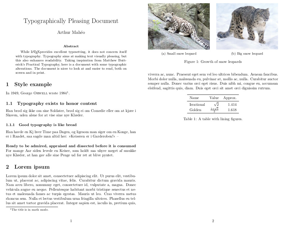
Result
Because a picture is worth a thousand word, here is what the new sectioning looks like.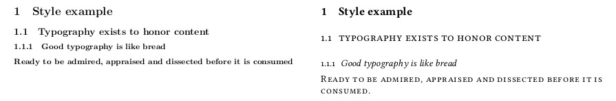
practical class (right).
Extra content
Finally, I like to move away from the bold everything that is the natural tendency in LaTeX. To do so, I will use small caps instead of bold for:
- caption labels;
- description lists; and
- abstract styling.
Captions
Caption labels are in small caps followed by a colon.
%% Modify caption labels
\usepackage{caption}
\DeclareCaptionLabelFormat{lc}{\flatcaps{#1}~{#2}}
\captionsetup{font=small, format=plain, labelformat=lc}
\captionsetup[subfigure]{labelsep=colon, labelfont=sc, labelformat=simple}
Lists
I prefer compact lists to the spacey ones provided by default. So, I will have lists flow with the text, with a normal lead, and they will have their items aligned at the paragraph indent – with the label in the interspace.
%% Modify list
\usepackage{enumitem}
\setlist{noitemsep}
\setlist{nosep}
\setlist[1]{labelindent=\parindent} % < Usually a good idea
%% Have to remove the bold and indent labels at the edge, text will still be
%% aligned at \parindent
\setlist[description]{font=\normalfont\flatcaps, labelindent=0pt}
As you may notice, my description lists and paragraphs look fairly similar – start at the margin, use of small caps. Description lists can be seen as regular lists without labels and emphasis on the first element, I decided to turn that first element into the label in a way.8
Abstract
An important feature of a research paper is its abstract, I decided to style it in a similar style to a section: in small caps, aligned left, and with a newline before the text. All of this done using the abstract package.
\usepackage[runin]{abstract}
\renewcommand{\abstractnamefont}{\normalfont\flatcaps}
\abslabeldelim{\newline}
\setlength{\abstitleskip}{-\parindent}
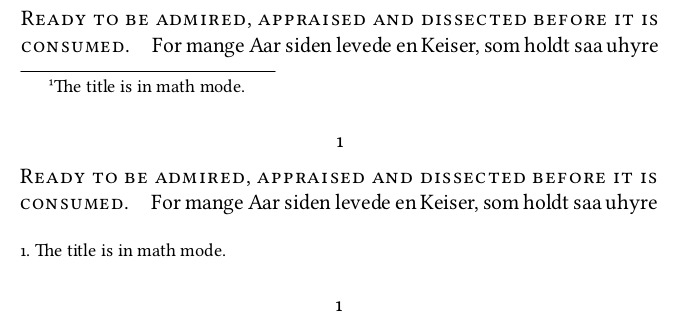
Styling footnotes
I re-style footnotes to look similar to lists: normal mark for the label situated in the “indent space” and text left-aligned. I use footmisc to remove the line above the footnotes and the indent. Finally, I use fnpct for proper, and automatic, kerning around punctuation.
\PassOptionsToPackage{norule, ragged, hang}{footmisc}
\RequirePackage{fnpct}
\RequirePackage{footmisc}
%% Footnote text aligned with text margin
\renewcommand\footnotemargin{\parindent}
%% Footnote text with a normal mark
\makeatletter
\renewcommand\@makefntext[1]{
    \@thefnmark.~#1}
\makeatother
Wrapping up
I have a few packages that always end up in my articles – most are the default provided by org-mode, feel free to cherry pick from the lot of them.
% Better tables
\usepackage{booktabs}
\usepackage{multirow}
\usepackage{longtable}
\usepackage{rotating}
% Maths stuff
\usepackage{amsmath}
\usepackage{amssymb}
\usepackage{mathtools}
% Wrap around figures
\usepackage{wrapfig}
% Better graphic handling
\usepackage{graphicx}
\usepackage{grffile}
% Sub-figures
\usepackage{subcaption}
\captionsetup[subfigure]{labelsep=colon, labelformat=simple, labelfont=sc}
% Spacing for macros
\usepackage{xspace}
There are many more tweaks you can add to your LaTeX file:
biblatexfor bibliography handling.hyperreffor links and their formatting, and metadata.clevereffor better referencing....etc.
Using the class
Well, I hope you learned as much as I did going through this. In my case, except having to switch to lualatex, this was a pretty painless journey and I am quite content with the results. We can all now enjoy professionally typeset and nice looking documents.
Originally, I was trying to develop templates – pandoc, org-mode and LaTeX. But these are harder to use and maintain. So, when reviving this post I decided to create a LaTeX document class template instead I’m glad I spent the time doing it. Do not hesitate to poke me if I forgot something or you just want a hand.
Post scriptum
I actually discovered that there exists a class called paper in LaTeX. It looks pretty good, a mix between a book and an article. But, as one says: “it’s the journey that matters.”
Footnotes
I say draft because the end result is dictated by the publisher. ↩
I actually discovered that while writing this post. LaTeX’s
\baselineskipis about 25%: 10/12pt, 11/13.6pt, 12/14.5pt. It’s actually a bit tall, we could go with a lower factor. However, there is no real way (that I have found) that allow to set a fixed lead. ↩See Font Recommendations for more options. ↩
Considered by many the single most useful LaTeX package. ↩
A book will add: Part and Chapter. ↩
Also not that I add a full stop at the end of the
paragraph. It is a requirement for a number of publishers and yet they do not add them by default. This makes it annoying if you change the sectioning and have to review where the full stops have to go. ↩I am not a typographer and cannot find any definite guide on how to style them. ↩